In the world of watchmaking, where tradition often reigns supreme, a century-old design philosophy continues to feel radically modern. It’s an aesthetic born not in the quiet valleys of Switzerland, but in a revolutionary German art school: the Bauhaus. Active for only 14 years, from 1919 to 1933, its influence punched far above its weight, forever changing our understanding of how everyday objects should look and feel. When this ethos is applied to the tiny canvas of a watch dial, the result is a masterclass in clarity, purpose, and understated beauty.
The core tenet of the Bauhaus, famously articulated as
“form follows function,” is the guiding light for its horological disciples. This wasn’t just a catchy phrase; it was a complete rejection of the ornate, decorative styles that preceded it. For a watch, the primary function is indisputable: to tell the time, quickly and without ambiguity. Every design choice on a Bauhaus-inspired dial serves this singular purpose. Anything that doesn’t contribute to legibility is deemed superfluous and is ruthlessly eliminated. What’s left is a design language of pure utility, where elegance is found in efficiency, not embellishment.
The Principles of Purity on the Dial
Understanding a Bauhaus dial is to understand a deliberate set of constraints. The designers weren’t just making things simple for simplicity’s sake; they were distilling an object down to its functional essence. This resulted in a few key visual characteristics that are instantly recognizable.
Minimalism and Geometric Honesty
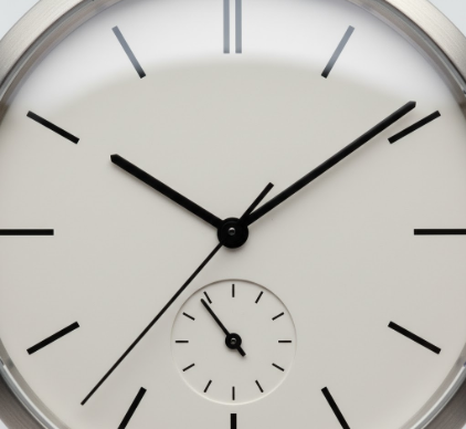
The most immediate trait is a profound sense of minimalism. You won’t find intricate guilloché patterns, applied gold indices with diamond-cut facets, or florid, calligraphic numerals. Instead, the dial is a clean slate, often in a monochromatic scheme of white, black, or silver. Graphics are reduced to their most basic forms. Hour markers might be simple printed batons or small dots. The shapes used are fundamental and geometric—the perfect circle of the case, the straight lines of the hands and indices. This wasn’t about being boring; it was about being honest with the materials and the object’s purpose. The beauty arises from the perfect harmony and proportion of these simple elements, creating a visual calm that makes reading the time an effortless glance.
When numerals are used, they are almost exclusively rendered in a crisp, clean, sans-serif typeface. The logic is straightforward: sans-serif fonts, stripped of the small decorative strokes found on serif fonts like Times New Roman, are easier to read at a small scale. The typography isn’t chosen for its historical charm but for its mechanical clarity. Often, the fonts have a geometric construction, with perfect circles forming the ‘O’ or sharp, unadorned angles. This choice reinforces the dial’s overall modernist, functionalist character. The font is not decoration; it is a precision tool for conveying information.
The Bauhaus philosophy championed the idea of the Gesamtkunstwerk, or a ‘total work of art,’ where all arts, including architecture, industrial design, and typography, would be unified. This holistic approach meant that even the font on a watch dial was considered a vital part of the cohesive, functional design. Every element had to work in concert with the others.
Purposeful Use of Color
While often associated with black and white, the Bauhaus school was deeply engaged with color theory, thanks to masters like Wassily Kandinsky and Paul Klee. However, color was never used frivolously. On a watch dial, it’s employed as a functional accent to highlight a specific piece of information. A bright red seconds hand provides a stark contrast against a monochrome dial, making it easy to track. A small blue dot might mark a power reserve indicator, or a yellow arrow could point to the date. The use of primary colors—red, yellow, blue—was common, used sparingly to draw the eye and serve a purpose without creating visual clutter.
The Masters and Their Modern Heirs
While the Bauhaus school itself didn’t produce watches, its students and adherents carried its principles into the world of industrial design, with horology being a perfect field for its application.
Max Bill: The Quintessential Example
Perhaps no name is more synonymous with Bauhaus watch design than
Max Bill. A Swiss artist, architect, and designer who studied at the Bauhaus in Dessau, Bill’s work with the German watchmaker Junghans in the late 1950s and early 1960s resulted in some of the most iconic timepieces ever created. His wall clocks and wristwatches are the purest expression of the form-follows-function ideal. The Max Bill watches feature impossibly clean dials, with a meticulously designed minute track, elegant and thin hands, and a custom sans-serif typeface where the number ‘4’ has a unique open-top construction. The gentle dome of the acrylic crystal flows seamlessly into the case, creating a single, pebble-like object. To look at a Max Bill watch is to see the Bauhaus philosophy perfectly realized.
Modern Brands Carrying the Torch
The enduring appeal of this design language is evident in the success of modern brands that have built their identity around it. German watchmaker
Nomos Glashütte is arguably the leading contemporary proponent of the Bauhaus ethos. Their watches are defined by their slender cases, clean dials, and an almost architectural sense of proportion. They even design their own in-house typefaces and use subtle color accents to great effect. Other brands like Stowa, with its Antea line, and Braun, under the legendary Dieter Rams (whose ‘less but better’ philosophy is a direct descendant of Bauhaus thinking), also continue to produce timepieces that prioritize legibility and rational design above all else.
The Lasting Appeal of Functionalism
So why, in an age of smartwatches that can display anything, does this century-old, minimalist aesthetic not only survive but thrive? The answer lies in its timelessness. Bauhaus design isn’t tied to a fleeting trend; it’s anchored in a universal principle of clarity. In a world saturated with information and visual noise, a Bauhaus-inspired watch offers a moment of quiet purpose. It does one thing, and it does it perfectly. It is a tool, but one elevated to an object of intellectual beauty through its commitment to logic and simplicity. It’s a reminder that good design isn’t about what you can add, but about what you can thoughtfully take away.