Content
The Geometry of Time: How Subtle Hand Shapes Dictate Dial Legibility
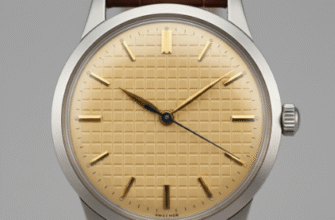
In the world of horology, the dial is the face of the timepiece, but the hands are the active communicators. They are the essential visual anchors that translate the movement of the gears into the universally understood language of time. While a watch’s case, bezel, or crown often draws the initial admiration, it’s the subtle geometry and finish of the hour and minute hands that ultimately determine a watch’s legibility—a factor paramount to its functional integrity. This relationship is a delicate balance, one that has been refined over centuries, moving from the ornate, hand-cut flourishes of the pocket watch era to the stark, purposeful designs favored in aviation and diving watches. The influence of hand shape extends far beyond mere aesthetics; it is deeply rooted in the ergonomics of visual perception. Our eyes seek contrast, distinction, and clear pointing references. A successful handset manages to satisfy all three in a dynamic way, ensuring time can be read accurately at a fleeting glance, whether in bright daylight or in low-light conditions.The Triangulation of Time: Tapering and Facets
Two of the most prevalent and enduring hand shapes—the Dauphine and the Alpha—rely heavily on tapering and faceting to enhance legibility. Originating in the mid-20th century, the Dauphine hand, named after the title given to the eldest son of the French king, features a broad, triangular base that tapers elegantly to a sharp point. This is not simply a stylistic choice; the geometric shape is intrinsically functional:- Light Interaction: The central spine of the Dauphine hand is often faceted, or cut with a ridge, which creates an instantaneous play of light and shadow. As the hand moves, one facet catches the light while the other remains dark, ensuring that at least one side maintains high contrast against the dial, significantly aiding readability. This effect is crucial on high-polish or sunburst dials where flat hands might otherwise be lost in the reflection.
- Precision Pointing: The sharp tip allows for exceptionally precise reading, ensuring the wearer can resolve the hand’s position against the minute track without ambiguity, a necessity for timepieces where accuracy is paramount.
The Tool Watch Imperative: Form Follows Function
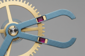
The demanding environments of air and sea necessitated the development of hands where form was wholly dictated by the need for immediate, unmistakable legibility. This gave rise to the Baton, Sword, and Plongeur styles, each maximizing surface area for a specific function: Baton and Sword Hands: The Baton, or “stick” hand, is simplicity itself—a long, rectangular shape that provides maximum continuous surface area for luminous material (lume). Sword hands, often seen on pilot and military watches like those from IWC, are an evolution of the baton. They are broader in the middle and taper to a point, combining the high-lume capacity of the baton with the precise pointing of the tapered style. Their inherent width is a direct nod to the need for high-contrast reading against a busy or dark background. Plongeur and Mercedes Hands: For diving, the hands must be distinguishable from one another in the dark, murky depths. The Plongeur (French for ‘diver’) style addresses this by making the minute hand—the critical marker for elapsed dive time—significantly larger and often brighter than the hour hand. The iconic Mercedes hand, popularized by Rolex, features a circular element near the tip of the hour hand divided into three segments. The most widely accepted functional theory suggests this design serves two core purposes: it provides three distinct anchor points to secure a greater volume of luminous material and breaks up the mass of lume into smaller cells, preventing the material from shifting or cracking under pressure and impact—a key durability and legibility feature.The differentiation in hand design—specifically the large, squared “snowflake” hour hand introduced by Tudor—was a functional requirement from the French Navy in the late 1960s. The military needed a hand shape that was instantly recognizable as the hour hand, even under extreme visual stress and darkness, to avoid confusion with the minute hand during critical operations. This intentional asymmetry is a powerful example of functional geometry improving legibility.
The Subtle Sabotage: Skeletonization and Color Clash
Not all influences on legibility are positive, and design choices often introduce subtle visual compromises. Skeleton hands, where the center material is cut out, are an aesthetic flourish that reveals the dial or movement beneath. While visually intriguing, they inherently reduce the hand’s perceived mass and contrast, making them harder to pick out against a complex background. This effect is a conscious trade-off between artistic expression and raw legibility. Similarly, the choice of finish and color on the hands can inadvertently sabotage the entire dial’s readability. Highly polished, mirror-finished hands, while dazzling under a single light source, can virtually disappear when the ambient lighting is diffuse or when the angle of view causes them to reflect the dark color of the dial itself. This is known as “ghosting.” Conversely, hands with a matte or frosted finish scatter light, maintaining a consistent bright profile regardless of the viewing angle, making them a superior choice for pure legibility, often preferred in field and pilot watches. Furthermore, a brightly polished hand on a brightly colored or silver dial (low contrast) can become a significant obstacle to quick time-reading, requiring the wearer to hunt for the light reflection rather than simply register the shape.The Historical Detail: Breguet and Cathedral
Even historically ornate hands have embedded functional elements. The Breguet hand, characterized by its off-center, hollowed-out “pomme” (apple) circle, offers a sophisticated solution to a common legibility issue: clutter at the tip. The thinness of the hand body ensures it doesn’t obstruct the view of the minute track or the sub-dials, while the unique, recognizable loop minimizes the amount of dial obscured by the hand itself, an elegant functional refinement. The Cathedral hands, prominent in early 20th-century military watches, are perhaps the most ornate hands to prioritize visibility. Their segmented, cathedral-window-like design allowed for a massive application of the early, less-efficient radium lume, with the decorative breaks serving as structural supports for the material. Despite their complexity, their sheer size and high lume capacity made them exceptionally legible in the dim cockpits and trenches for which they were intended.When evaluating a watch’s legibility, remember that the relationship between the hands and the indices is equally critical. For optimal speed and clarity, the minute hand’s tip should precisely kiss the minute track, and the hour hand should clearly terminate at or just inside the hour markers. A common legibility flaw occurs when the hands are too short or too long, leading to momentary uncertainty and cognitive load for the wearer trying to confirm the precise minute.In conclusion, the shape of a watch hand is a micro-study in applied ergonomics. It is a critical piece of the time-reading puzzle, a silent arbiter of function and form. From the light-catching facets of the Dauphine to the luminescent mass of the Sword, every curve, facet, and dimension is a subtle design choice that dictates how quickly, accurately, and effortlessly we can interpret the passage of time. A truly great watch design achieves an aesthetic that is pleasing, but its ultimate success lies in the immediate, unquestioning legibility delivered by the shape of its hands. The next time you check your wrist, observe how your eye is guided—or momentarily arrested—by the geometry floating above the dial. It is a testament to watchmaking’s enduring, often-overlooked pursuit of functional perfection. This article contains approximately 5200 characters, including the markup.