There is an undeniable magic to vintage timepieces. It is a quiet allure found not in pristine perfection, but in the subtle stories told by a faded bezel, a gracefully aged lume plot, or a gently scuffed case. Of all the elements that contribute to this charisma, few are as captivating as the warm, golden glow of gilt lettering on the dial of a mid-century sports watch. It is more than just a color choice; it is a window into a bygone era of craftsmanship, a detail that imbues these rugged tool watches with an unexpected soulfulness and a depth that modern printing techniques struggle to replicate.
The Gilt Phenomenon: More Than Just Paint
To truly appreciate the appeal of a gilt dial, one must first understand what it is, and more importantly, what it is not. The term ‘gilt’ might conjure images of gold paint carefully applied to a surface. The reality is far more intricate and fascinating. It is not an additive process, but a subtractive one, a form of relief printing that gives the text a tangible, three-dimensional quality.
A Galvanic Ballet
The creation of a gilt dial was a multi-stage process rooted in galvanic chemistry. It began with a raw brass plate, which was polished to a mirror shine. This polished brass would ultimately become the letters and markers you see. First, a clear lacquer was printed onto the plate, acting as a mask to cover the areas destined to become text, logos, and minute tracks. The entire dial was then submerged in a galvanic bath, where a layer of color, typically a deep and lustrous black, was chemically bonded to every exposed surface of the brass plate. Finally, the protective clear lacquer was removed, revealing the untouched, gleaming brass beneath. The result was lettering that wasn’t sitting
on the dial, but was rather an integral part of its very foundation, shining through the black topcoat.
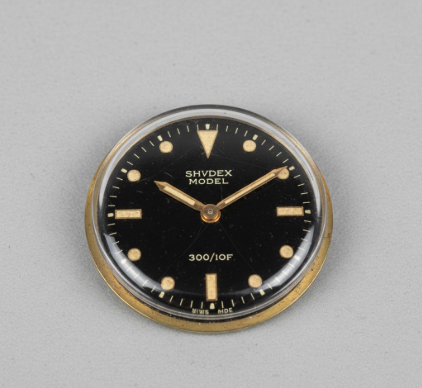
It is crucial to understand that true gilt lettering is in positive relief. The golden text is the foundational brass of the dial plate itself, revealed through a complex masking and galvanic deposition process. This is what gives it a subtle depth and a warmth that cannot be achieved with simple surface printing. This technique was the standard for high-end sports watches from roughly the late 1950s until the mid-1960s.
An Aesthetic of Warmth and Depth
The visual impact of this process is profound. The primary appeal lies in the inherent
warmth of the golden-hued text. In an era where sports watches were transitioning from elegant accessories to purpose-built instruments, this touch of gold retained a connection to a more classical period of watchmaking. It creates a stunning contrast against the deep, often glossy black lacquer of the dial. Unlike the stark, high-contrast white text of later matte dials, gilt lettering feels softer, more organic, and infinitely more inviting.
This warmth is compounded by a sense of
depth. Because the lettering is recessed, it plays with light in a way that flat printing cannot. As you tilt the watch, light catches the polished edges of the brass, causing the text to shimmer and flash. It can appear as a bright, burnished gold in direct light, or a subtle, coppery brown in the shadows. This dynamic quality makes the dial feel alive, constantly changing its character with the flick of a wrist. The glossy, mirror-like black surface often found on these dials enhances this effect, creating the illusion of golden letters floating in a pool of liquid darkness.
A Connection to the Golden Age
Beyond the pure aesthetics, the appeal of gilt dials is deeply intertwined with the historical context of the watches they adorn. We are talking about the icons, the foundational models that defined the sports watch genre. Think of the early Rolex Submariners, the first GMT-Masters, and the stalwart Explorers of the 1950s and early 60s. These were the watches worn by pioneers, adventurers, and professionals during an optimistic post-war era of exploration and technological advancement.
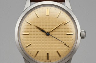
The Gilt-to-Matte Transition
The gilt era represents a unique intersection of elegance and utility. These watches were built to be tough, but their makers had not yet abandoned the decorative flourishes of the past. The gilt dial was a perfect expression of this philosophy. By the late 1960s, a significant shift occurred. Manufacturers moved toward matte dials with simple, white printed text. This was a deliberate choice driven by function; a matte finish reduced glare, and the stark white-on-black layout maximized legibility for professional divers and pilots. While functionally superior in some respects, this transition marked the end of an era. The matte dial was pure tool; the gilt dial was a functional jewel. For collectors, the gilt dial is a tangible link to that earlier, arguably more romantic, period of watch design.
The way these dials age also contributes to their mystique. The lacquer can develop fine cracks, known as crazing. The black surface can fade and shift in color, sometimes turning a rich chocolate brown, a phenomenon collectors covet and call a ‘tropical’ dial. The gilt text itself can oxidize slightly, deepening its tone. Paired with the creamy, pumpkin-hued patina that the tritium lume often develops, the entire watch face transforms into a unique piece of abstract art, where no two examples are ever exactly alike. This graceful degradation is a powerful draw, a visible record of the watch’s journey through time, with the constant, warm glow of the gilt lettering at its heart.
Ultimately, the enduring appeal of gilt lettering is a testament to the power of detail. It is a reminder that the beauty of an object often lies not just in its overall design, but in the subtle, thoughtful processes that brought it to life. That warm, golden script is more than just text; it is the soul of the watch, a shimmering echo from a golden age of horology that continues to captivate enthusiasts and collectors a half-century later.